 |
The Middle Corona Forum |
| Forum Links |
| Introduction |
| Instruments |
| Observations |
| Phenomena |
| Models |
| News |
| Links |
| Tools |
| Contact |
| Disclaimer |
| Home Page |
| Tweets by MiddleCorona |
|
The Middle Corona Forum |
| Forum Links |
| Introduction |
| Instruments |
| Observations |
| Phenomena |
| Models |
| News |
| Links |
| Tools |
| Contact |
| Disclaimer |
| Home Page |
| Tweets by MiddleCorona |
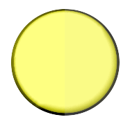
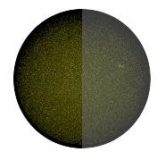
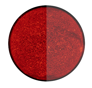
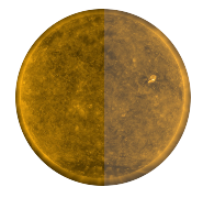
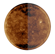
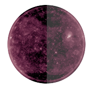
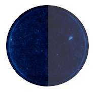
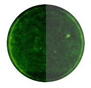
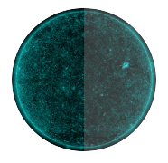
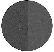
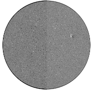
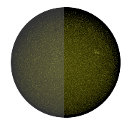
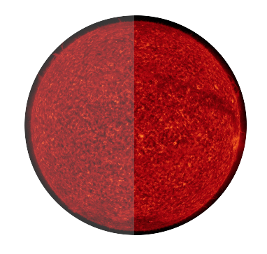
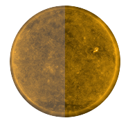
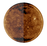
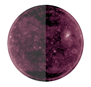
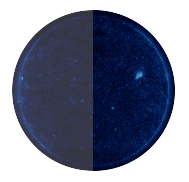
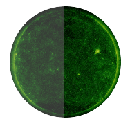
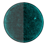
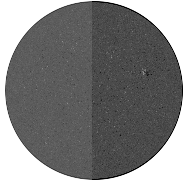
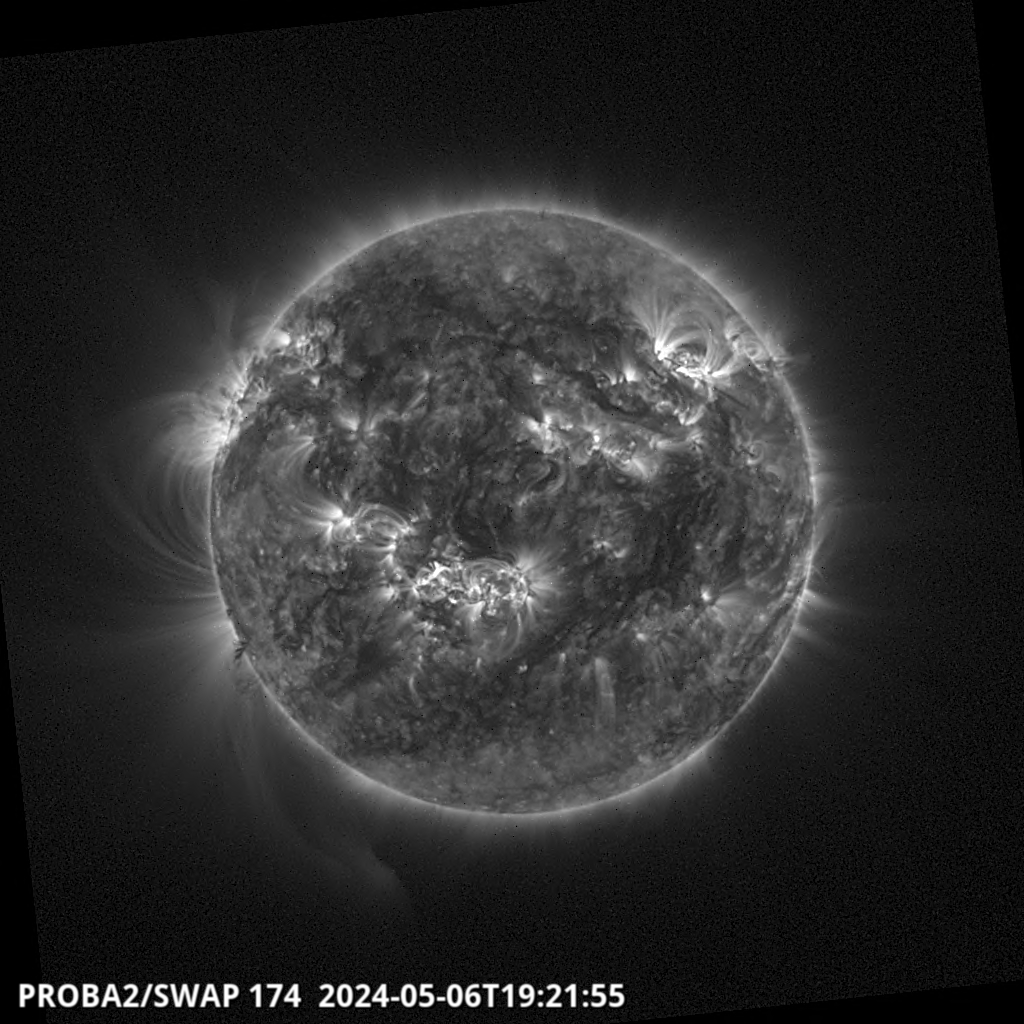
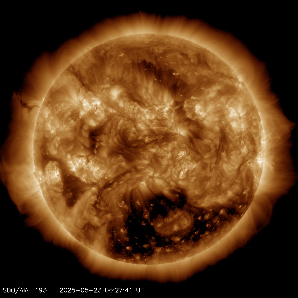
Brief introduction - Use the following tool to compare the latest AIA, SWAP EUV and HMI magnetogram observations. Select the small images of the sun below to compare different pasbands.
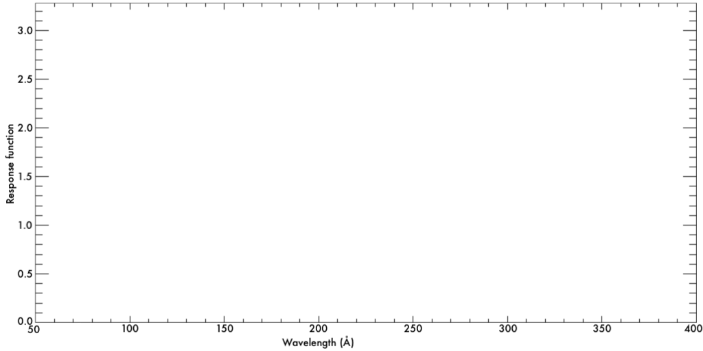
For the AIA EUV lines (indicated in black) you can see the corresponding temperature responses in the coloured bars and the normalised temperature response plot below. The correspondng wavelength response is seen in the bottom plot.
Be aware that sometimes there are small time differences between the images and movements may effect how the images line up.
If you would like to display the images in full resolution, go here.